Wealth Distribution
- Noelle Sawyer
- Jun 9, 2019
- 2 min read
Updated: Dec 1, 2021
In the Spring of 2018, I team taught the second semester of a calculus sequence with Professor Chris Rasmussen. (It was fantastic working with him, by the way!) We put together a lot of new material for the course, since it was only the second time that it was being run. The sequence is meant for students who have not previously taken calculus. We had our students do a fair amount of group work and discussion. I had a lot of freedom to come up with activities for the class. That meant that I had a list of ideas that I was ready to bring up at any time. This is one of my favorites.
The Lorenz Curve and the Gini Index
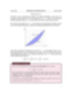
This came about later in the semester when we were wanted an application of integration that worked well for a single class period. The Lorenz curve is a curve that models how wealth is distributed within a group of people. L(x) = the proportion of the total wealth that the bottom x part of the population holds. The ideal Lorenz curve is L(x)=x. That is, the bottom x percent of the population holds that same proportion of the wealth.
The area between a given Lorenz curve and the ideal curve can be interpreted as how unfairly the wealth is distributed. The interpretation of this value is known as the Gini index. A perfectly equal distribution has an index of 0, while a country where one person hold all of the wealth would have an index of 100.
This worksheet guides students through gaining some intuition about how Lorenz curves behave. Then, later, they can work through an example and calculate the Gini index for that example. On the day that I used this, my class was more engaged than usual, especially considering that it was pretty late in the spring semester.
You can look through the worksheet below, or look at the pdf here. If you'd like the tex, just shoot me an email!
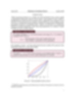

Page 6 is intentionally blank - we handed pages 7 and 8 out to each group after they had discussed the earlier pages.

If you're interested in what the Gini Index is for a country that actually exists, the CIA World Factbook has a list. Remember, a lower index means a more equal distribution of wealth! As a warning, the Gini index for some countries is not based on very recent data. The list does tell you the date that the data was pulled from, though.
Trading Economics also has a bar chart here of how the Gini Index of the US has changed over the last few decades.